While I still have a ton of blog updates to write on our house, I couldn’t wait to dig into the biggest, and in my opinion, most important renovation of them all.
THE KITCHEN.
It is where everyone goes not only to cook, eat and drink, but to talk, to laugh, to celebrate…to spill wine and spill your guts, to make meals but moreover, make memories. As my mom always says, the kitchen is the heart of the home.
And this kitchen is going to have my heart. Even if I still can’t decide on countertops or backsplash.
As I wrote in my lawn updates post, the laundry list of problems we encountered on our first walk through was very long. The exterior jungle aside, we weren’t crazy about the floors (or should I say, floor, as there was only one kind), didn’t understand why bedroom walls were knocked down (more on that in a future post) and weren’t too sure about the fireplace set in the dead middle of the house. But when we walked into the kitchen, both of us stopped and looked at each other with a smile….this could be our dream kitchen.
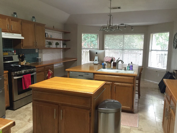
Key words: could be. As the way it stood when we first walked through, the area was huge – but, as with most things in the house, the layout didn’t quite make sense. There were two islands – which, when I tell people, seems luxurious – but one was very small, and the other was very big. And they both just didn’t make sense. The smaller one was meant to be a standing butcher block cutting board, which, due to the size constraints and my messy style of cooking, caused most ingredients spilled on the floor. The larger one was offset to the back of the kitchen with an extended overhang that, while it could sit a few people around it, cut out any room for an actual kitchen table.
And the natural light that flooded in was a dream, except upon our walk through, the windows were covered by three shelves where – surprise! – more plants lived. There was also a not-so-sturdy window seat that wrapped around the bay windows, although I barely trusted setting my purse down on it. However, I could only see the potential for what it could be: perhaps a wrap-around bench filled with bright pillows where one would sit drinking coffee in the morning light? YEA BABY.
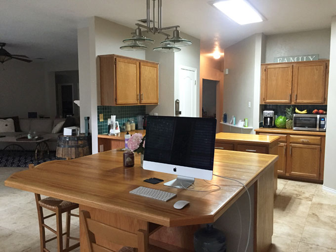
Speaking of light – while natural light flooded the room during the day, the artificial lights chosen to brighten the room by night were…not so great. There was one large, yellow “cafeteria light,” as we liked to refer it, as well as generic, college townhouse-type lights that hung above where a kitchen table should be but, due to the monstrosity that was the second island, couldn’t be. The result was a dim, yellow- lit space that wasn’t all that inviting to spend time in after sunset.
The wood cabinets were in good shape but the square green tile backsplash gave them a very dated look. Plus, some of the overhead cabinets were a bit short in depth, leaving the doors ajar after I unpacked our plates. There was also this weird, long countertop overhang across the window that we didn’t know what to do with. (Besides tear out the second we could!)
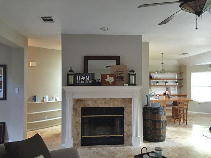
Another thing we didn’t know what to do with: the huge fireplace/cabinet area that closed in the kitchen space. I mean, the kitchen was still huge with it there. But the potential of the kitchen – and the whole house – with it removed was a very interesting thought.
Of course, I absolutely hated to see the fireplace go. But I’ll go into more detail on that in a different post. :)
I can’t tell you how many nights we sat staring at that kitchen in the first few weeks we moved in. And just how many Fixer Upper kitchen pictures I had pulled up constantly on our desktop computer, iPad and my phone. If you think I enjoyed Googling “all white farmhouse kitchens” before…you have no idea what my browser history looks like now. I mean…check out my Pinterest board.
So yes, I had an idea of what I wanted. White cabinets, big island, massive farmhouse sink, white subway tile. But when we actually started visiting kitchen design places, the range of other options clouded my already decided Pinterest dreams. Maybe we wanted GRAY cabinets! Or rose gold handles! Or white cabinets with a sea green island! Or white cabinets and island with blue tile! Should we put a window above the sink? And cushioned window seats around the three windows? How much money am I spending in my head right now?
Yea. THAT was fun. Aesthetic details aside, we finally found a local place that could offer all of my combo options and then some, with no strings, no hassle and, most importantly, great prices: UB Kitchens. After speaking with more boutique shops before going with UB, I finally understood why people say kitchen remodels – especially cabinets – are insane expensive. (Especially when companies don’t provide you with an itemized list, and you are obliviously paying for the nicest wood INSIDE the cabinets that no one ever notices.)
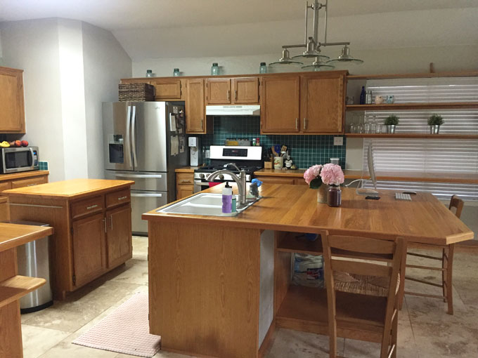
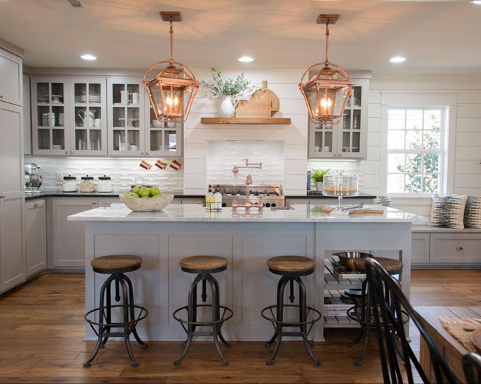
With UB, we we able to see where our money was going…which allowed for us to whittle down the original quote we received by almost 50 percent. And still holding tight to my original, white country kitchen dreams. Here is our old kitchen, followed by my Fixer Upper kitchen design inspiration, and then the final design sketch of our new and improved kitchen to come.
(Also need to give a special shout to Matt’s cousin/our dear friend Chris, who was a HUGE help in figuring out how to make the layout in my head an actual layout in reality!)
Our kitchen, as of July 1:
Our dream kitchen:
Our new kitchen design sketch:
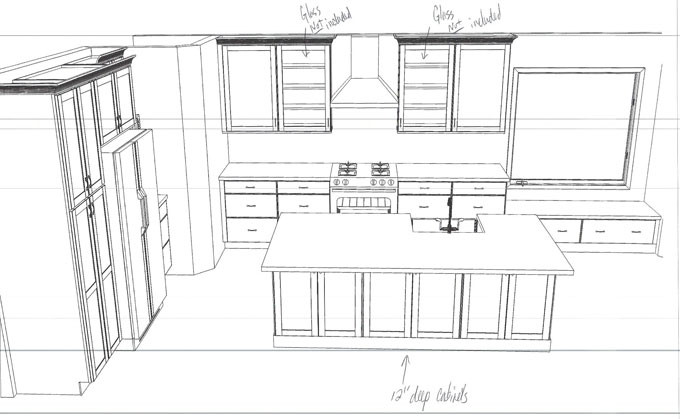
You obviously can’t tell in the design sketch, but we went with all white cabinets and a light gray island. I really loved the idea of a different color island, but because you can pick any color in the Sherwin Williams’ catalog and because Matt really wanted to design this kitchen while we were still in our 30s – we went with a safe light gray. I felt that it was different enough to give the kitchen additional color and warmth, but not so different that I would be worried about a) getting sick of it or b) having to stick to a color palette for other kitchen design elements.
The one island is massive – about eight feet long! – and houses our dishwasher and garbage/recycle bins. On the other side of the island, we will have bar seating for four, in addition to three outer-facing cabinets for additional storage. And of COURSE, also included in this island of ours is my long-lusted-after farmhouse kitchen sink. Be still my heart! It was delivered weeks ago, and some nights I weirdly spend a good 10-15 minutes staring at it before I tip toe to into bed. It is that dreamy.
Although the island can house a small family, since it will now be positioned in the middle of the kitchen, we have room for an actual kitchen table. A thing like that! And while I loved the idea of window seats around the three bay windows, I wasn’t too crazy about a kitchen table being pushed up against the window seat. I kept picturing a booth-type situation at a restaurant…one person has to pee and everyone needs to stand up.
Instead, remember that other window with the counterop cutting across it that I didn’t know what to do with! Well, wa-la! It is now our window seat area. And as you can see…this area is spot on with my Fixer Upper kitchen design inspiration. :) I will have to make the seat cushion, though, so if anyone has sewing tricks that they would like to share (or if you can hop on a plane to Texas to teach me), I would greatly appreciate it. I’ll feed you in homemade baked goods once we have a working oven again.
Which…isn’t for another few weeks! By the time we (ahem, I) made a decision on the cabinet colors, UB Kitchen’s orders/delivery schedule was backed out into September. Which was good in a way, as we had plenty of other updates that needed to happen before the kitchen went in. But in a bad way, we haven’t had a home cooked meal (unless you count PB&J) in more than three weeks. Who knew that weight gain was a side effect of kitchen remodeling?
The time does give me space to overanalyze our very last two kitchen decisions: backsplash and countertops.
We are still planning on sticking with white subway tile, despite my casual browsing of “white cabinets, colored backsplash” images on Google. But for countertops…I am torn. I love the look of white quartzite countertops on gray cabinets, but am undecided if I want them on the white cabinets, too, OR if I should go with a light or dark gray on white. I’ve stalked enough kitchen photos to have seen both examples done, but I still can’t make up my mind on which option I like more. I also am in love with the rose gold cabinet handles on gray cabinets as seen in my Fixer Upper kitchen design inspiration photo, but am weary about them looking way more fancy than rustic when put on white cabinets.
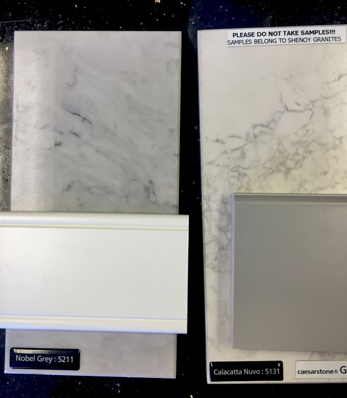
I would love to hear your thoughts – and Matt would desperately love someone else to have these conversations with me. Let me know what you think!
In the meantime, I will start working on my next renovation updates, including the house layout, the floors and, of course…DEMO DAY.





O M G ………….LOVE……don’t leave so much time between posts. I AM CURIOUS !!
I can’t wait to see it!!! I need your help over here with my kitchen. Want to come home soon and take care of it for me? You have such a great eye for decorating. Your house will be the envy of the neighborhood. Hope I get to Austin soon to see it for myself!